Pull out your phone right now and load your own website. Try scrolling. Try tapping a button. Try reading the text. Does it work? Does it feel natural, or does it feel like you're fighting the site to do basic things?
Most of your customers are on their phones. 60% of Google searches happen on mobile devices. Google indexes the mobile version of your site first—not the desktop version. This isn't the future of SEO. It's the present. And if your site doesn't work on mobile, you're invisible.
This isn't about design trends. It's about whether people can actually use your site on the device they're holding.
The Five Things That Actually Matter
Mobile SEO has a lot of moving parts. But if you get these five things right, you've covered 90% of the work:
1. Speed
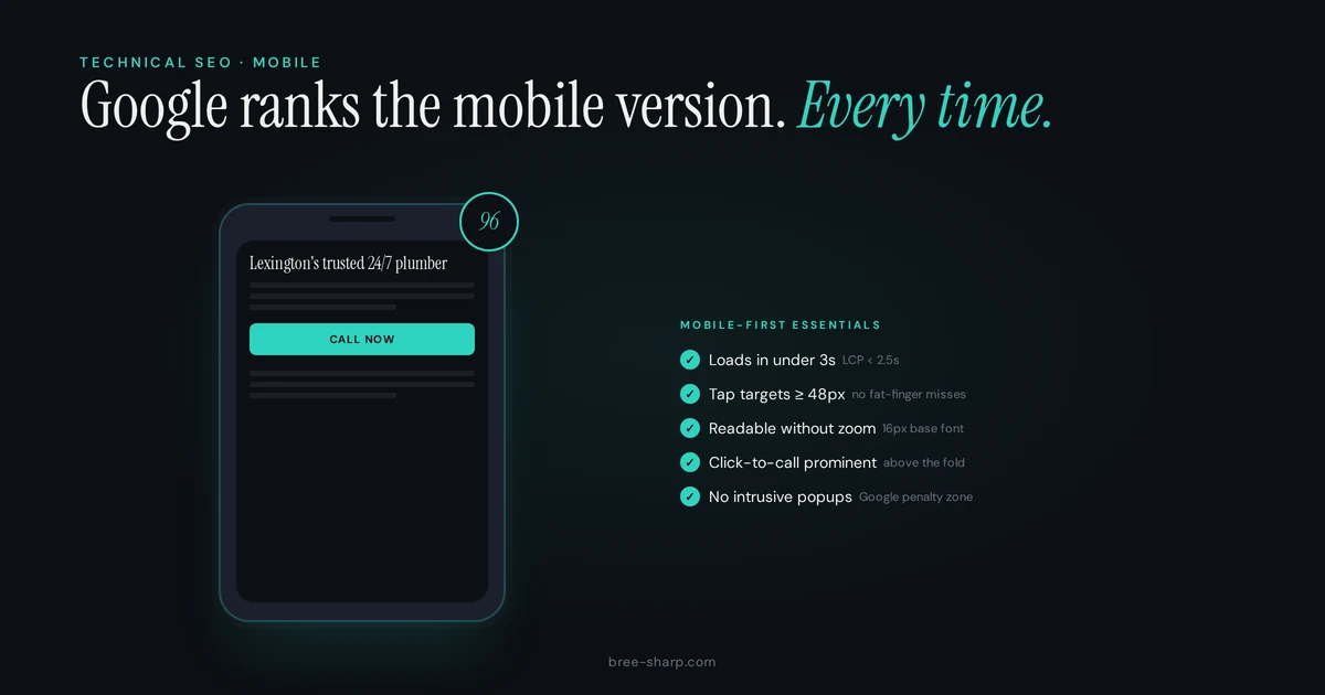
On mobile, every second counts. Most people abandon a page if it takes more than 3 seconds to load. Your images are probably the culprit—high-resolution photos that look great on desktop are massive files on mobile.
Test your site with PageSpeed Insights. It'll tell you exactly what's slow and how to fix it. Common fixes: compress images, use a content delivery network (CDN), minimize CSS and JavaScript. A good developer can usually knock 2-3 seconds off load time with these changes alone.
Speed matters for Google too. It's a ranking factor. A faster site ranks better, gets more clicks, and converts better. Speed is free SEO.
2. Responsive Design
Responsive design means your website automatically adjusts to the screen size. One design, all devices. No separate "mobile site" with a different URL. Not in 2026.
Test this yourself: rotate your phone between landscape and portrait mode. Do the buttons stay accessible? Does the text reflow, or does it get cut off? Does the layout rearrange intelligently, or do you see sideways scrolling?
If your site wasn't built with responsive design, you need to fix it. This is foundational.
3. Tap Targets
A "tap target" is anything you click—a button, a link, a form field. On mobile, tap targets need to be at least 48 pixels apart from each other. Not 44 pixels. Not 40. Forty-eight. This is the size of a human finger.
If you put buttons too close together, people accidentally tap the wrong one. Your conversion rate drops. Angry users hit the back button. Google sees a high bounce rate and thinks your page isn't relevant.
Make sure your phone number is a clickable link with a tel: link. Same with your email and contact form. Every call-to-action should be a tap target, not something you have to pinch and zoom to use.
4. Click-to-Call
This is the single highest-ROI mobile optimization you can make. Put your phone number in the header with a tel: link. When someone finds you on mobile and wants to call, they should be able to do it with one tap.
One tap. Not "find your phone number," not "copy and paste," not "dial manually." One tap, and the phone opens the call app with your number pre-filled.
Track these calls separately from web form submissions. You'll probably find that 40-60% of your mobile conversions are phone calls, not form fills. If you're not tracking them, you're invisible to your own success.
5. Readable Content
On a 5-inch screen, 12-point text is too small. Your minimum should be 16px. Paragraphs should be short—3-4 sentences max. Line spacing should be 1.5x or higher. Headlines should be large and clear.
Think about reading your content on a phone while standing up, maybe in sunlight, maybe while a dog is barking. Every design choice matters. Make it easy.
What Google Is Actually Measuring
Google uses three metrics to evaluate mobile performance. They're called Core Web Vitals, and they're ranking factors:
- Largest Contentful Paint (LCP): How long does it take for the main content to load? Target: under 2.5 seconds.
- First Input Delay (FID): How responsive is the site to taps and clicks? Target: under 200 milliseconds.
- Cumulative Layout Shift (CLS): Does the page jump around while loading? Target: low visual instability.
These aren't obscure metrics. They're measuring the actual experience of someone using your site on mobile. PageSpeed Insights gives you scores for all three. If you're in the "needs improvement" zone, you need to fix it.
The Mobile Problem Nobody Talks About
Here's something that catches a lot of business owners off guard: many WordPress themes hide content on mobile. The sidebar disappears. Blog posts are stripped down. Contact information is hidden behind a menu. The theme looks good, so you think it's fine.
But Google sees it too. Mobile-first indexing means Google is crawling and indexing your mobile version. If your theme hides content on mobile, Google sees the stripped-down version. That's what gets indexed. That's what ranks.
You can have a beautiful desktop site and an invisible mobile site. Check what Google actually sees by using the Mobile-Friendly Test and looking at the "How Google sees your page" section.
Mobile SEO Checklist
Quick mobile audit: Can someone find your phone number in 3 seconds? Can they see all your services without scrolling more than twice? Can they hit the contact button on their first try?
If you answered "no" to any of these, you have mobile optimization work to do.
Use this checklist to audit your own site:
- Page loads in under 3 seconds (test with PageSpeed Insights)
- Layout responds to screen size (test by rotating your phone)
- Buttons and links are at least 48px apart
- Phone number is in the header with a tel: link
- Font size is minimum 16px
- Paragraphs are short (3-4 sentences)
- No horizontal scrolling required
- Contact form is accessible without zooming
- Core Web Vitals are in the "good" range (green in PageSpeed Insights)
- Mobile version isn't hiding important content
FAQ
Will optimizing for mobile hurt my desktop rankings?
No. Mobile optimization is good for both mobile and desktop. Google prioritizes fast, responsive sites on all devices. Better mobile experience equals better overall SEO.
How do I test if my website is mobile-friendly?
Use Google's Mobile-Friendly Test at search.google.com/test/mobile-friendly. It checks responsive design and flags specific issues. But also just pull out your phone and use the site yourself. Does it work? That's the real test.
Do I need a separate mobile website?
No. A responsive website (one design that works on all screen sizes) is the modern standard. Separate mobile sites create maintenance nightmares and confuse Google. Build responsive once, not twice.